AI Compass - Vibe Code Platform for Strauss Strategy

Not another AI report — a living compass for decision-making.
AI Compass is an executive-facing system designed for Strauss Strategy to transform how organizations navigate AI adoption.
The Challenge
To bridge the gap between complex datasets and intuitive logic — transforming static reporting into a living, strategic environment.
The Impact
I took full ownership of the product's evolution, turning 'cold numbers' into a functional, executive-grade asset that builds C-level trust through human-centric storytelling.
Not another AI report — a living compass for decision-making.
AI Compass is an executive-facing system designed for Strauss Strategy to transform how organizations navigate AI adoption.
My challenge was to bridge the gap between complex datasets and intuitive logic — transforming static reporting into a living, strategic environment.
The impact |
I took ownership of the product's evolution, transforming an initial concept into a fully functional, executive-grade system. By combining real-time survey insights with Strauss Strategy’s expert analysis, I bridged the gap between complex datasets and ion, enabling executives to identify gaps, trends, and risks at a glance, without information overload.
Role
UX/UI & Interaction Designer (End-to-End)
Role
UX/UI & Interaction Designer (End-to-End)
Tools
Base44 (AI no-code) · JavaScript · ChatGPT
Tools
Base44 (AI no-code) · JavaScript · ChatGPT
Team
CTO · COO · Head of AI · HR · CEO
Format
Web App · Interactive Report · Dashboards · Data Visualization
Format
Web App · Interactive Report · Dashboards · Data Visualization
Team
CTO · COO · Head of AI · HR · CEO
Overview
Problem
The data was extremely heterogeneous and dense, with no accessible format for interpretation. The team was close to abandoning the idea of an interactive product and reverting to a static report unless a usable, intuitive interface could be created quickly.
Goal
Create a working MVP within 4 weeks that transforms raw data into digestible, decision-ready insights—establishing a consistent visualization logic, reducing cognitive load, and proving that an interactive interface is both feasible and valuable.
My Role
Product Designer & No-Code Strategist // Specializing in Complex Data Systems & Interactive Logic.
Took full ownership of the product's lifecycle—from defining the interaction logic for complex datasets to end-to-end implementation in Base44. By overcoming platform constraints and designing scalable visualization rules, I transformed a static concept into a viable, executive-grade tool in record time.
Overview
Problem
The data was dense and fragmented, with no accessible format for interpretation. The team was close to abandoning the interactive product for a static report—unless a usable interface could be built, and fast.
Goal
Deliver a working MVP within 4 weeks that transforms raw data into decision-ready insights. My mission: prove that a complex, interactive interface is both feasible and high-value.
My Role
Product Designer & No-Code Strategist Specializing in Complex Data Systems
I took full ownership of the lifecycle—from defining interaction logic to end-to-end implementation in Base44. By overcoming platform constraints, I delivered a scalable, executive-grade tool in record time.
Key Highlights
Visual Language
The Challenge
Project Rescue & System Deadlock
Inherited a stagnant architectural concept under a strict 4-week deadline. The project required a complete pivot from a non-scalable prototype to an executive-grade dashboard, mapping diverse, complex question types into a unified and scalable visual system.
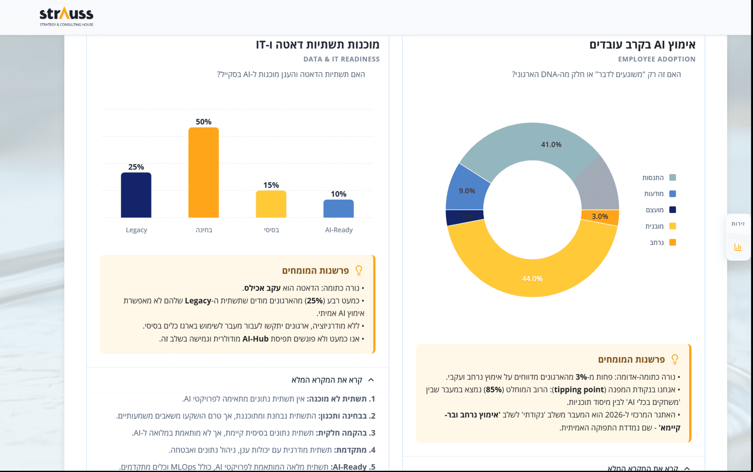
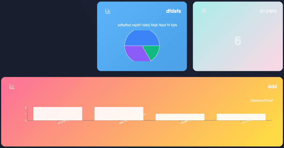
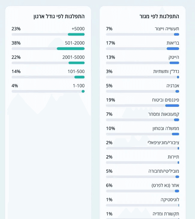
Data Noise & Information Fatigue
Transforming heavy, unstructured survey data into a dynamic UI system to prevent executive information fatigue. The goal was to architect a cross-platform hierarchy that remains legible and navigable, solving 'infinite scroll' and drop-off issues on both desktop and mobile.
Bridging the Technical Gap
Overcoming critical No-Code and LLM constraints previously deemed "impossible". This required mapping multi-layered data into a functional visual hierarchy, bridging the gap between fragmented AI outputs and the high-fidelity, brand-aligned aesthetics required for C-level users.
Project Rescue & System Deadlock
Under a strict 4-week deadline, I transformed a non-scalable architectural concept facing raw AI constraints into an executive-grade system, capable of unified data mapping.
Pre-Intervention
Generic LLM output lacking executive depth

Heavy text density and poor space optimization
Non-scalable concept facing raw AI constraints
Inefficient hierarchy in high-density data
Post-Intervention
Unified, Executive-Grade Visual System

Pre-Intervention
Non-scalable concept facing raw AI constraints
Post-Intervention
Unified, Executive-Grade Visual System
Data Noise & Information Fatigue
I designed a clean, organized UI that fixes information overload. This clear hierarchy makes complex survey data easy to scan, solving 'infinite scroll' and drop-off issues across all devices.
Pre-Intervention
Heavy text density and poor space optimization
Post-Intervention
Structured grouping to reduce cognitive load
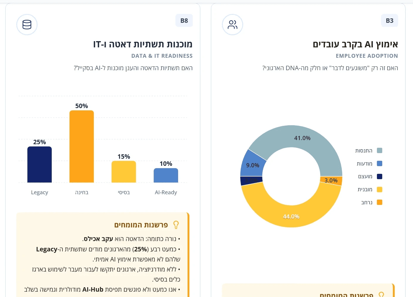
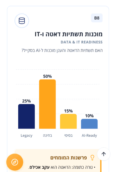
Bridging the 'Impossible' Gap
I engineered solutions to critical No-Code constraints, labeled as labeled 'impossible'. By mapping multi-layered AI data into a vibrant visual hierarchy, I delivered the sophisticated look executive users demand.
Pre-Intervention
Unified, Executive-Grade Visual System
Post-Intervention
Transforming raw AI into clear visual insights
The Strategic Challenge
The Results
Impact & Results

SWIPE TO SEE MORE
Connect to Content
Add layers or components to infinitely loop on your page.
Launched under a strict 4-week deadline, this platform transformed fragmented AI outputs into a strategic, executive-grade dashboard.
By bridging the gap between technical data and human-centric storytelling, I turned 'cold numbers' into a living asset that builds C-level trust and ensures long-term strategic value.
Key Decisions
Scalable Information Architecture
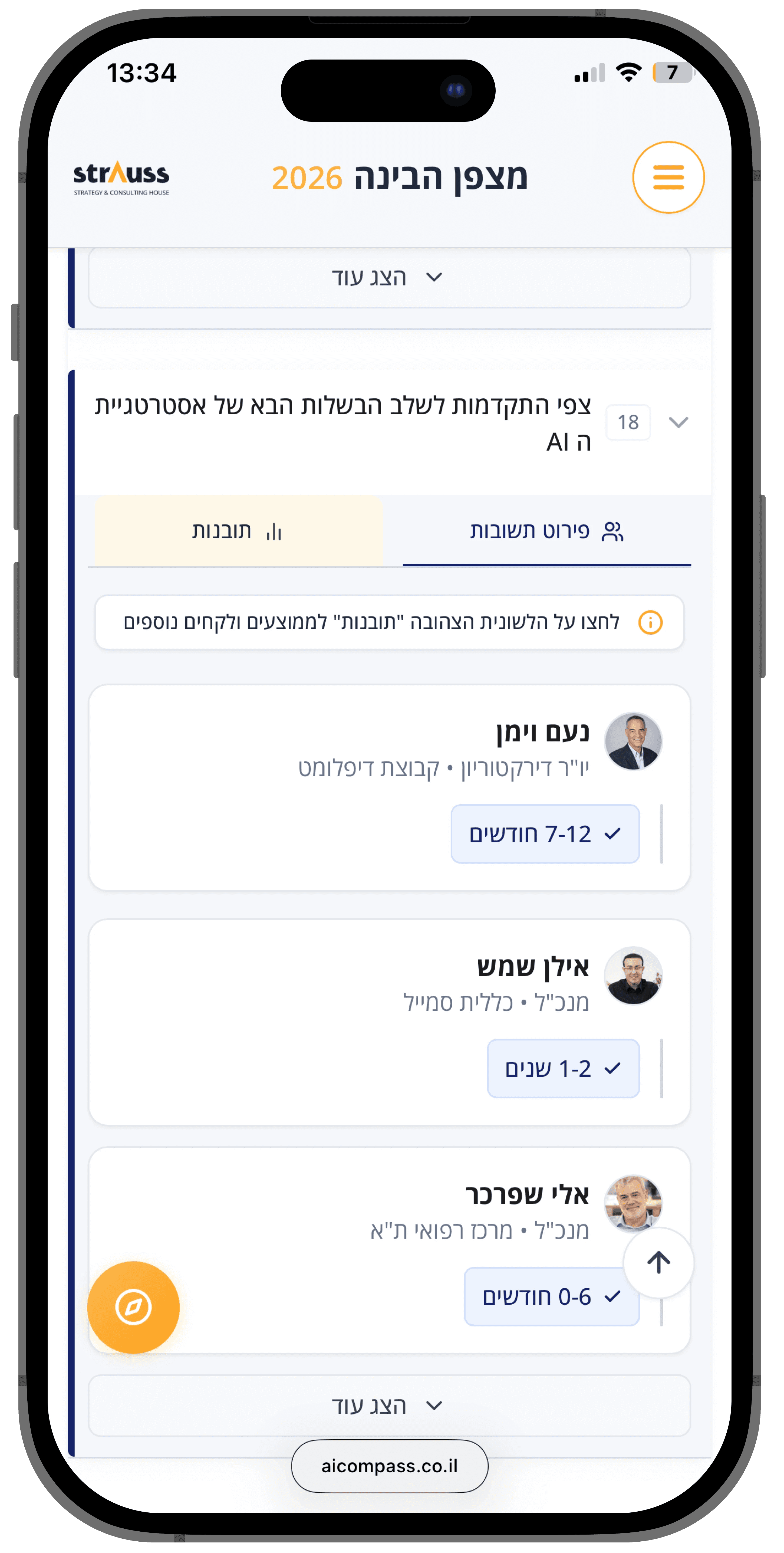
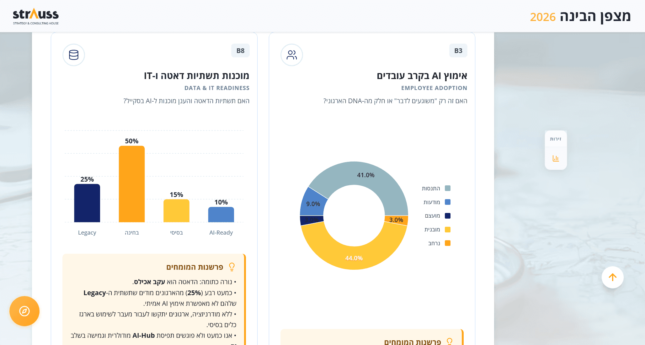
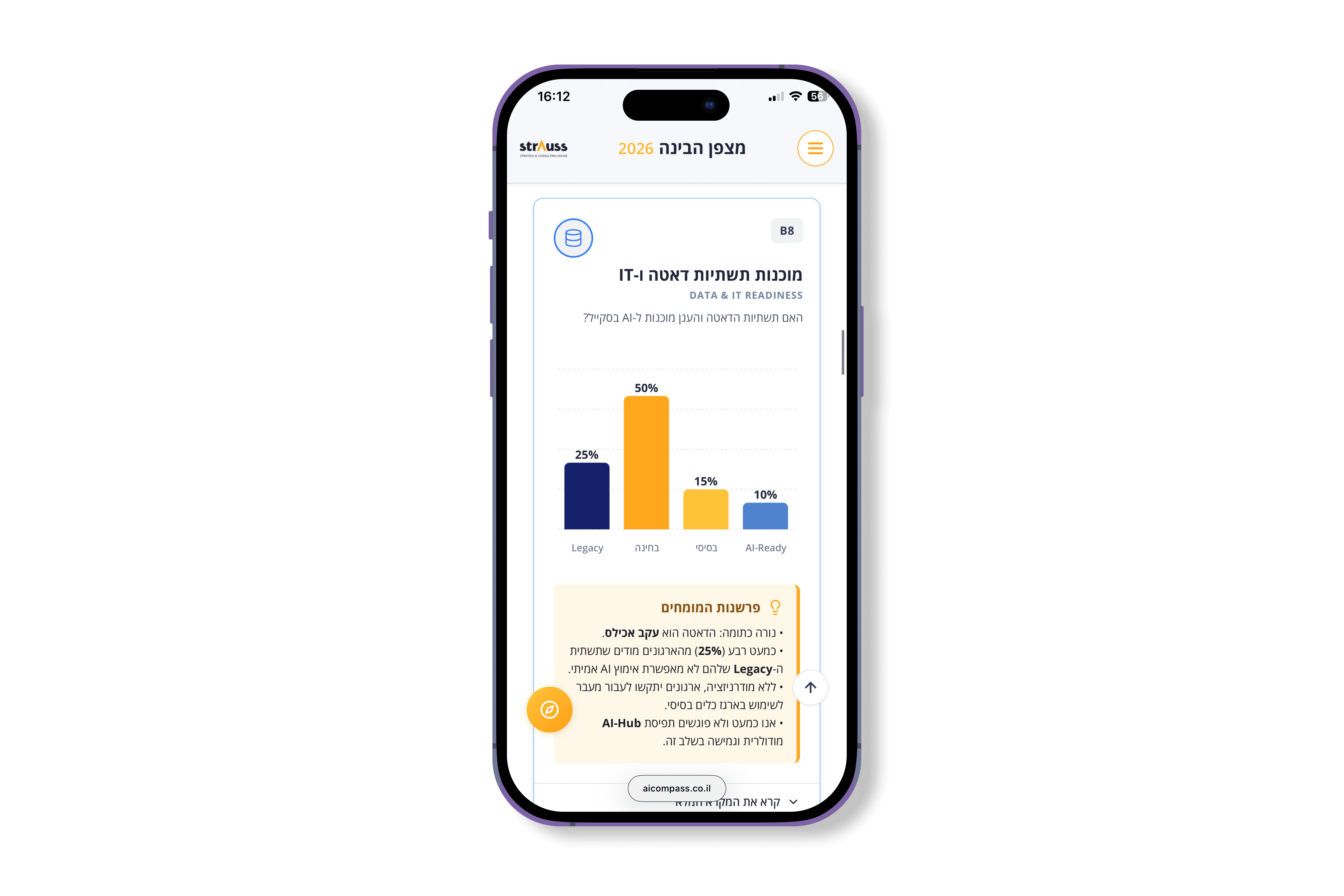
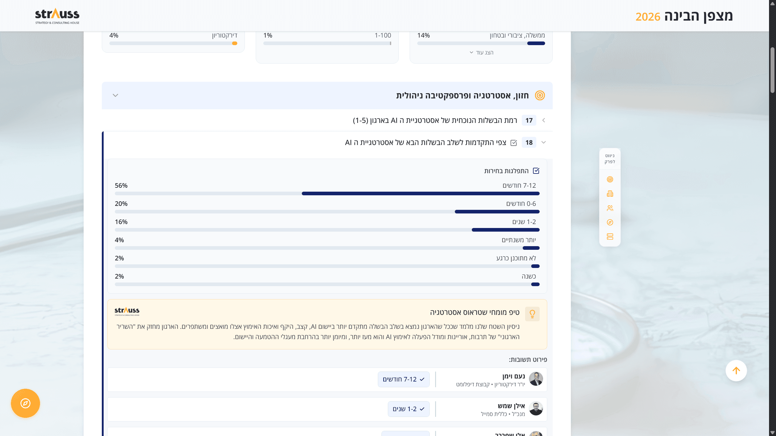
The Decision: I developed a strategic ruleset to map complex AI data into modular components and professional charts, supported by intuitive navigation shortcuts.
The Why: This resolved the 4-week deadline "deadlock." By replacing static reports with a navigable structure, I eliminated "infinite scroll" fatigue and ensured the data was clear and actionable.
Strategic Expert Framing
The Decision: I created a distinct "Consultant’s Lens" UI frame (using signature orange iconography and styled cards) to house Strauss Strategy’s expert analysis.
The Why: To bridge the gap between raw data and actionable strategy. By visually separating human insights from automated results, I built executive trust and highlighted the advisory value.
Comparative Decision Logic
The Decision: I prioritized a direct comparison between the user's specific data and the general industry average for every data point.
The Why: Executives need context to act. Showing "where I stand" compared to the benchmark allows for immediate interpretation and much faster decision-making.
Impact & Results
Launched within a strict 4-week timeline, this platform transformed fragmented AI outputs into a high-fidelity, strategic dashboard for Strauss Strategy’s C-level clients.
I took deep ownership of the visual architecture, ensuring the design effectively presented both technical data and rich human insights. My goal was to prove that while a tool can be AI-driven, it needs a human-centric story to build executive trust. This project demonstrates how a designer can partner with AI to turn 'cold numbers' into a living, strategic asset.

